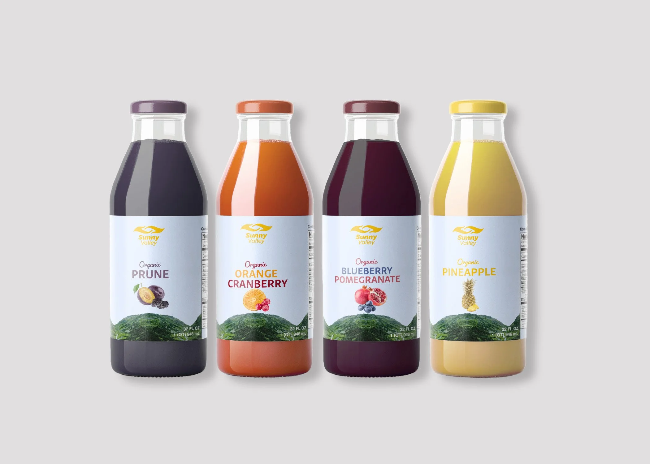
The Challenge
Looking for a refreshed bottle label, Sunny Valley seeked a 32oz bottle label that better reflected the brand's legacy while appealing to a growing modern audience. Their existing packaging no longer communicated premium quality, freshness, and authenticity. With limited label space and a crowded retail environment, the redesign centered on creating a visually compelling design that told the story in seconds and stood out on the shelf.
The Sunny story began in the Sunny Valley neighborhood of San Diego, where founder Fred Eastern ran a small fresh-fruit business and delivered fruits and juices to hotels on Five Points. These early years established a commitment to quality and hard work that continues to shape the brand today.
In the late 1970s, Fred’s son, Thomas Eastern, expanded the company’s vision by introducing the trademark Quality Pressed® line of not-from-concentrate juices. Leadership later transitioned to Fred’s grandson, Scott Eastern, who now serves as Chairman & CEO.
Across three generations, the Eastern family has guided Sunny with a focus on responsible stewardship and a mission to provide high-quality juices to customers throughout the United States and around the world.
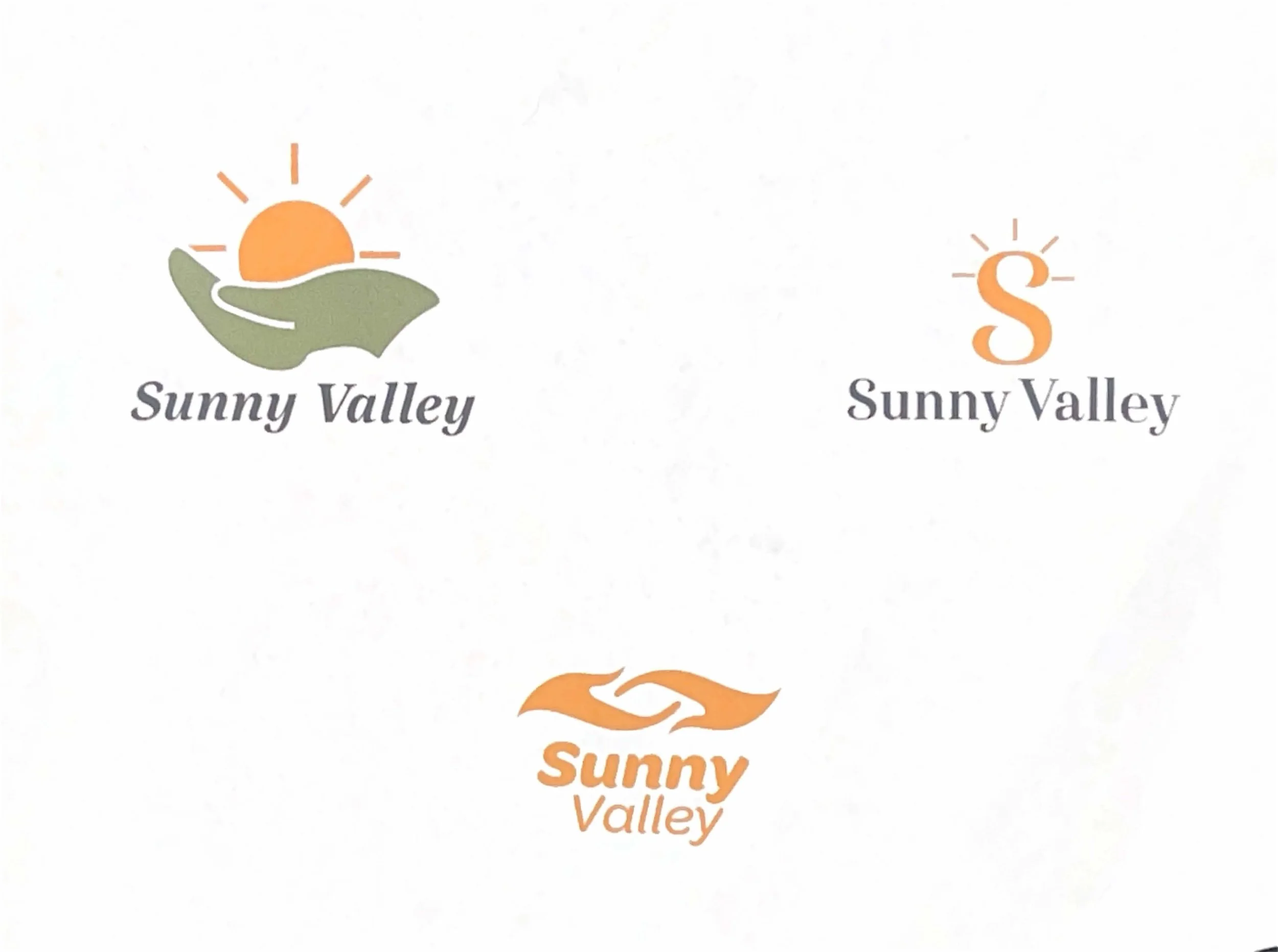
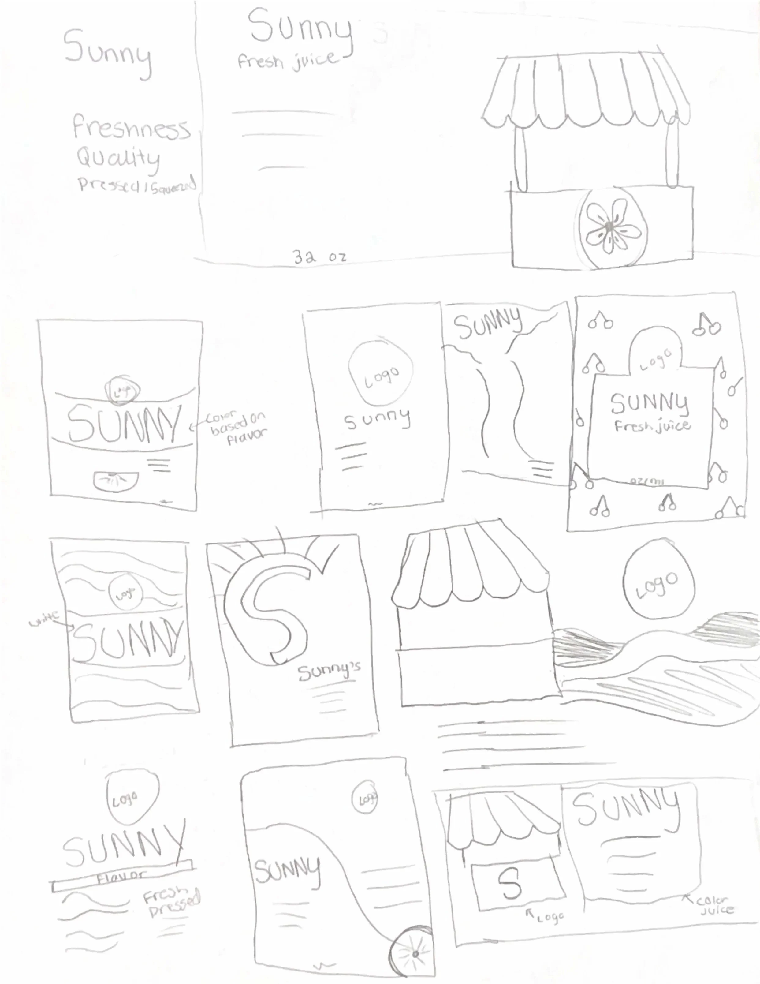
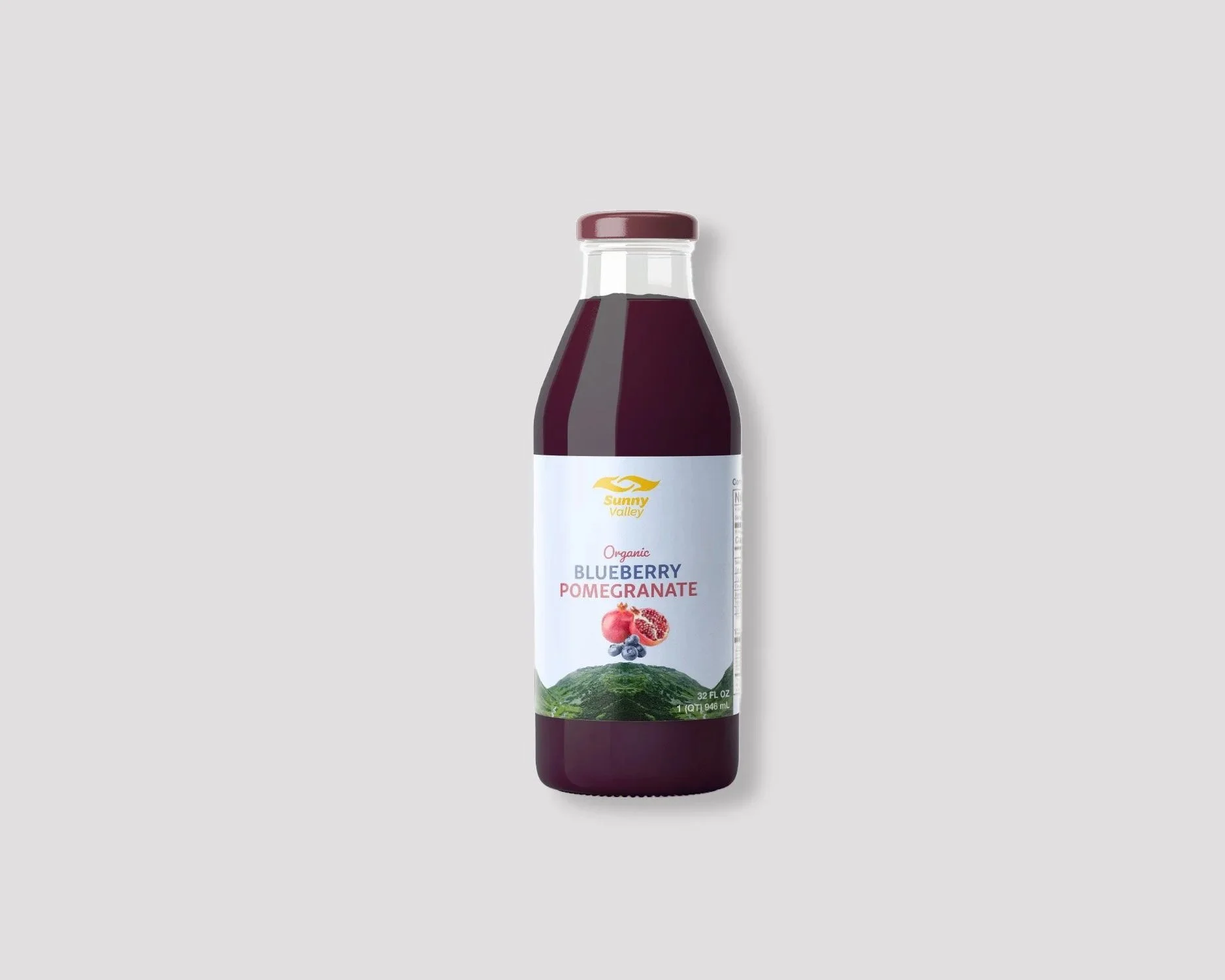
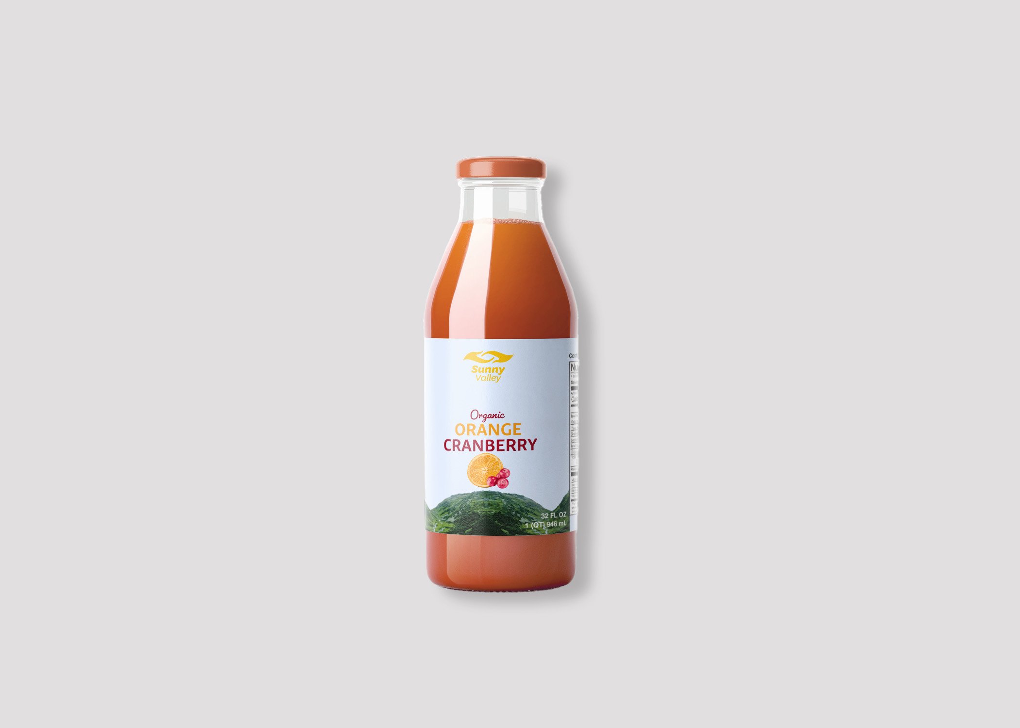
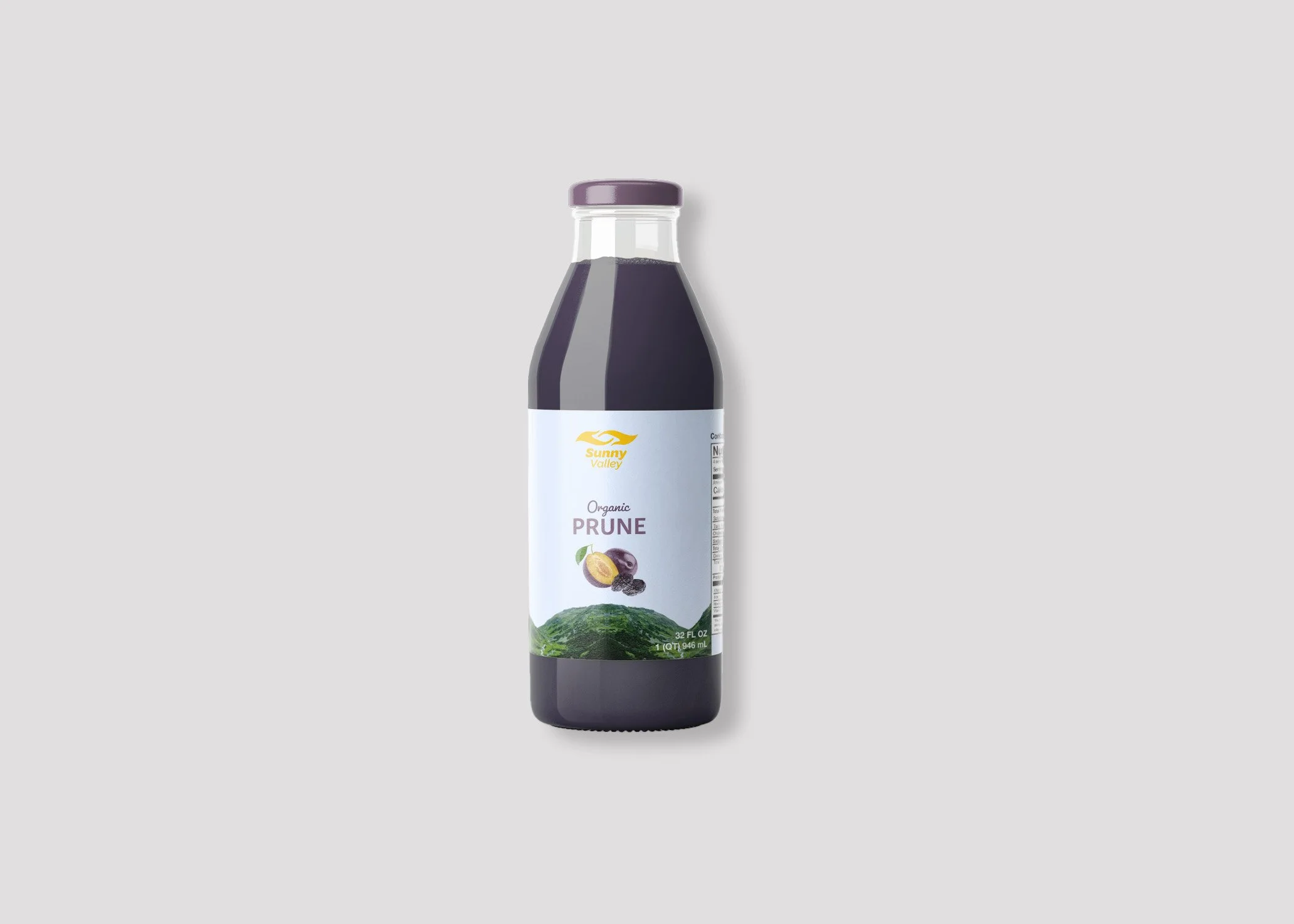
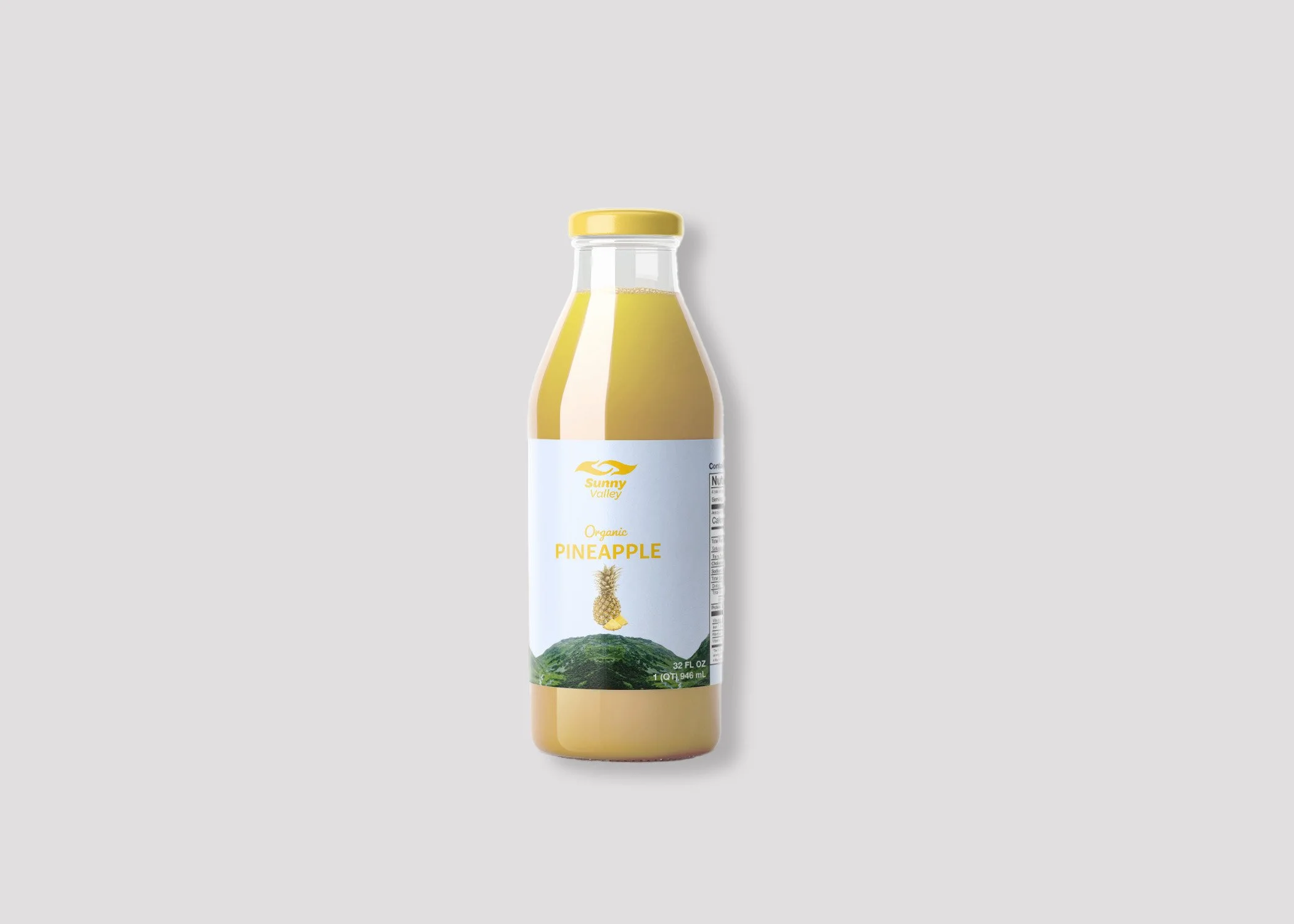
The Solution
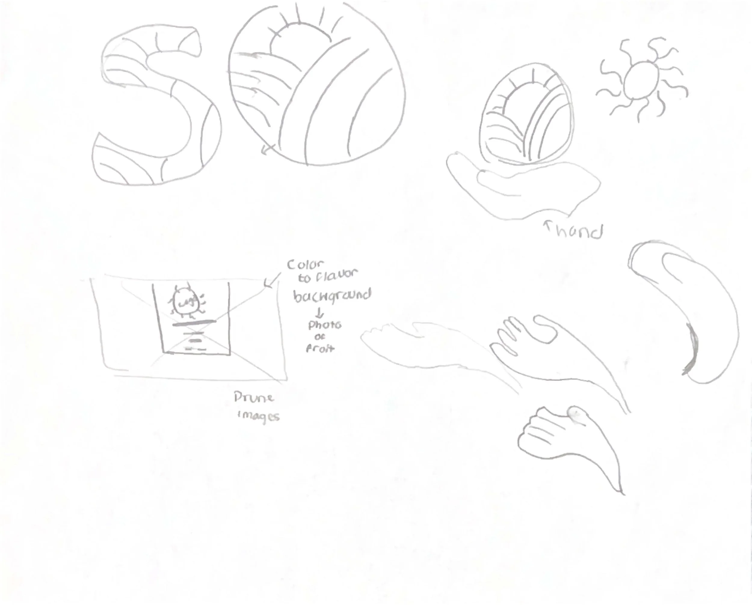
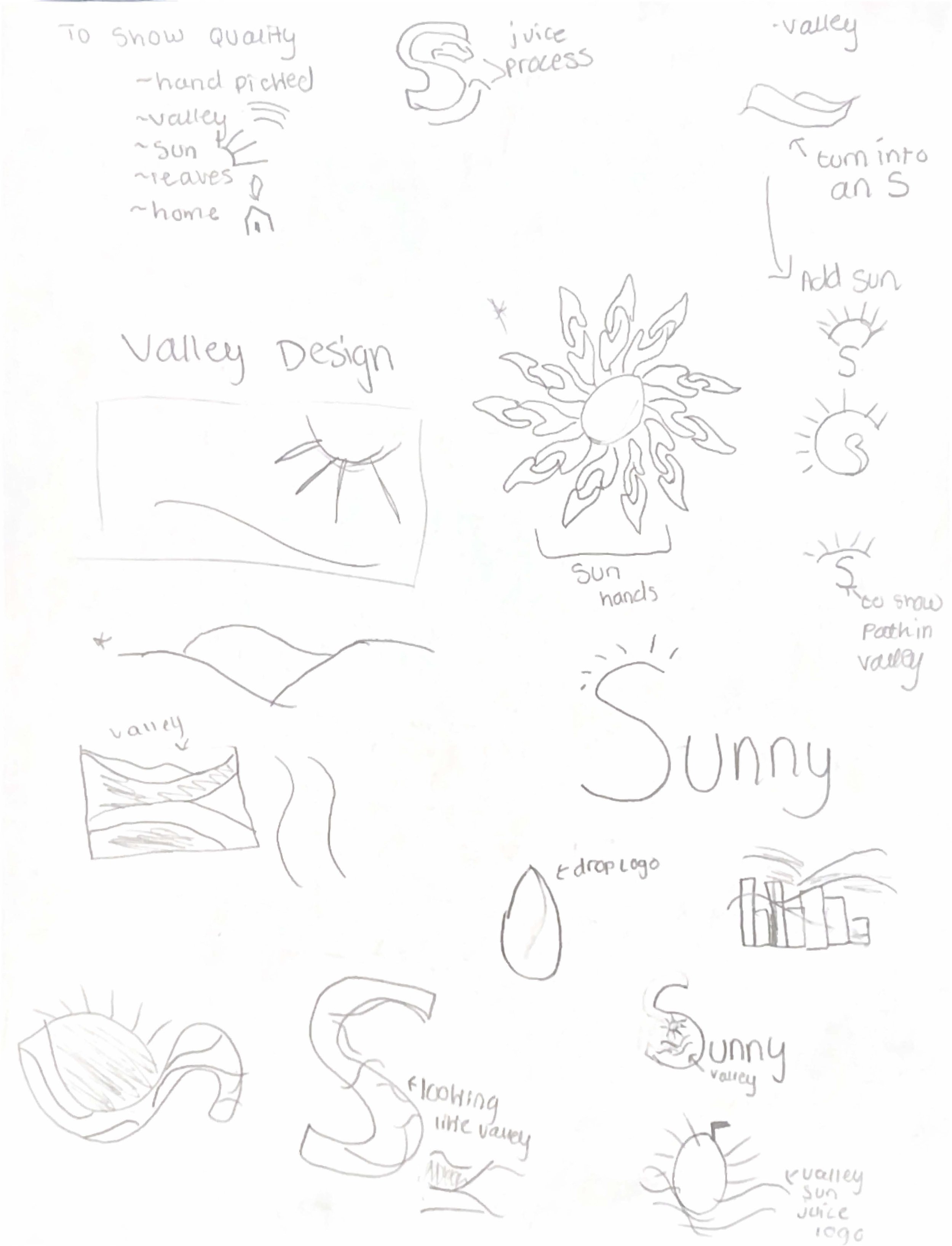
To achieve this, the refreshed concept blends heritage with modern simplicity, beginning
with a redesigned logo that reflects the brand’s small, hands-on family roots. The label communicates craftsmanship, quality, and trust through thoughtful design elements. Its carefully crafted packaging design and visual artistry stand out on crowded shelves while sharing Sunny Valley’s story with consumers. This renewed visual identity invites consumers to connect with the brand’s roots, with the carefully crafted label mirroring the hand-crafted juices once delivered to local hotels. It brings forward a sense of authenticity that honors the brand’s past while supporting its continued growth.
-
![Sunny Valley]()
Sunny Valley
-
![]()
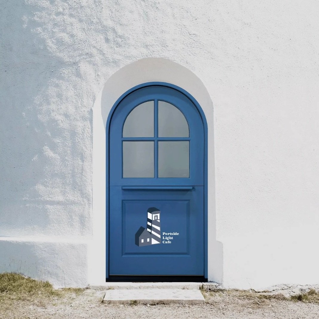
Portside Light Cafe
-
![]()
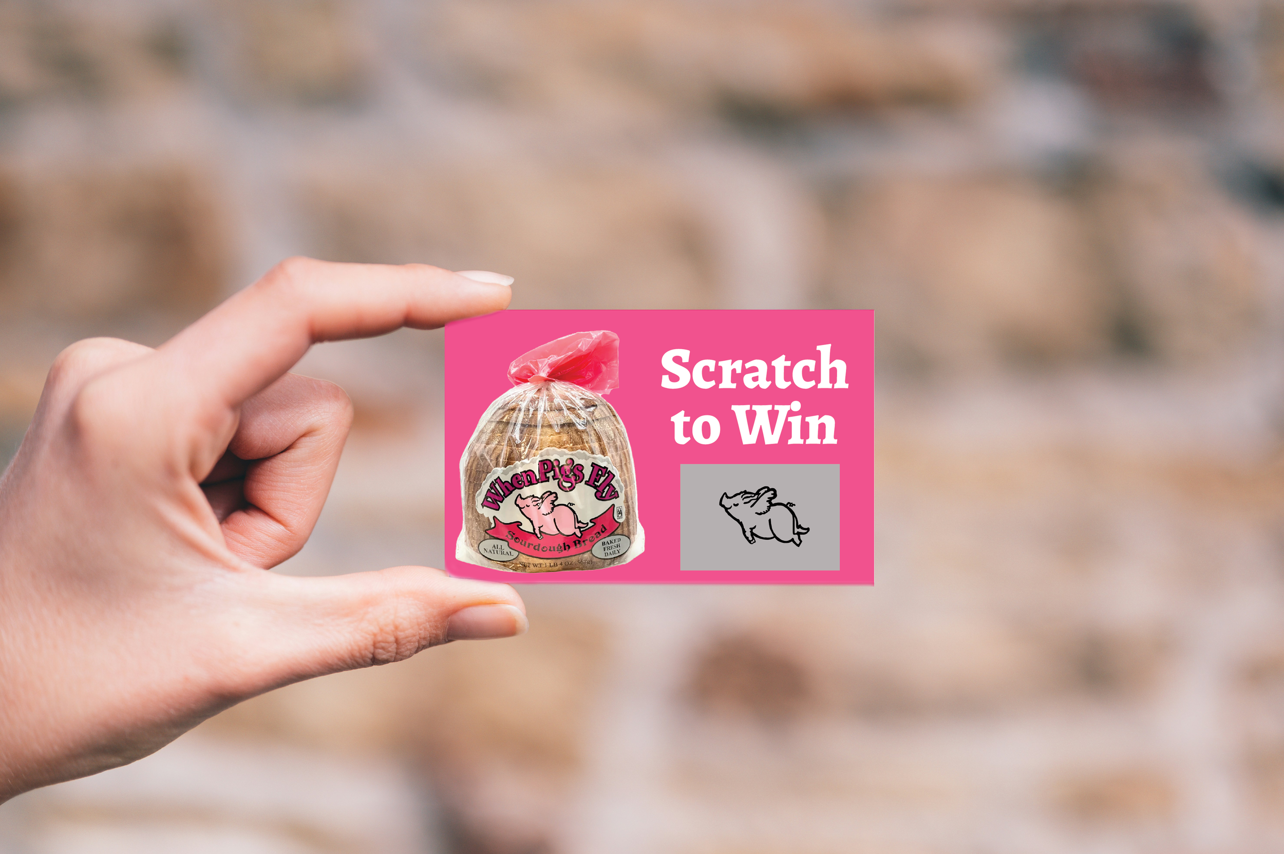
When Pigs Fly
-
![]()
Votago Travel
-
![]()
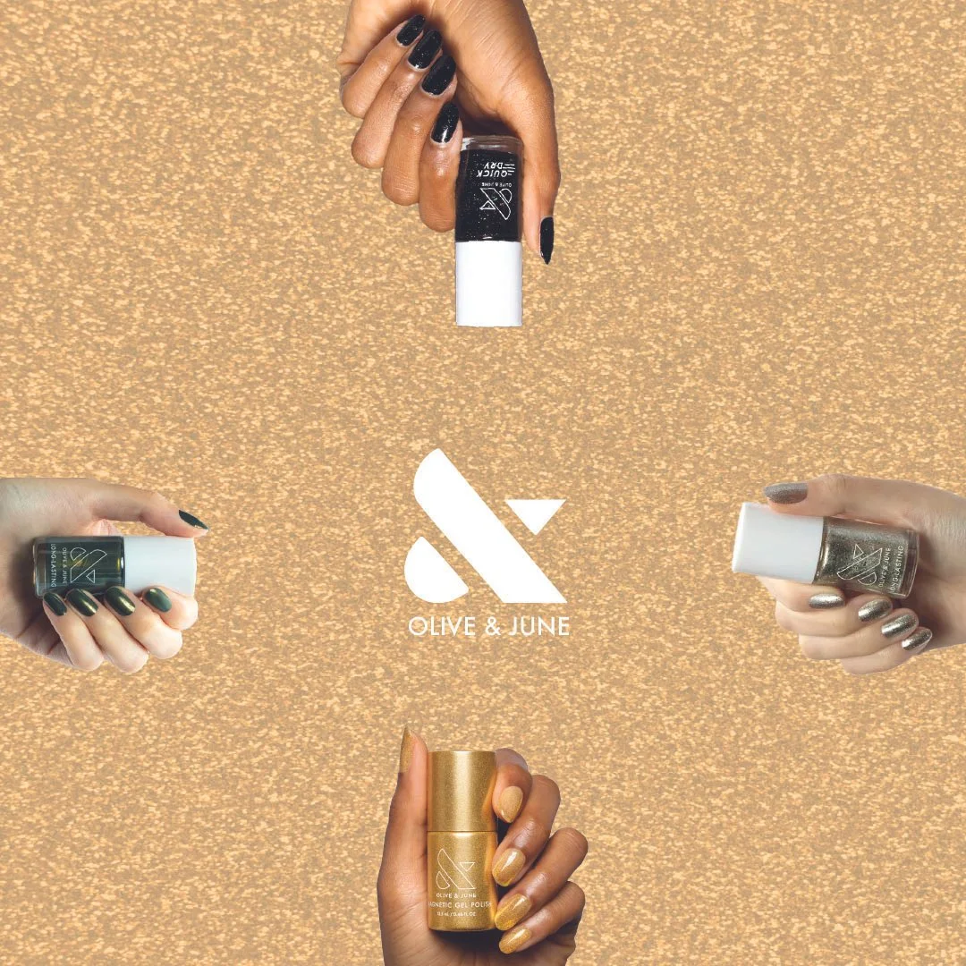
Olive & June
-
![]()
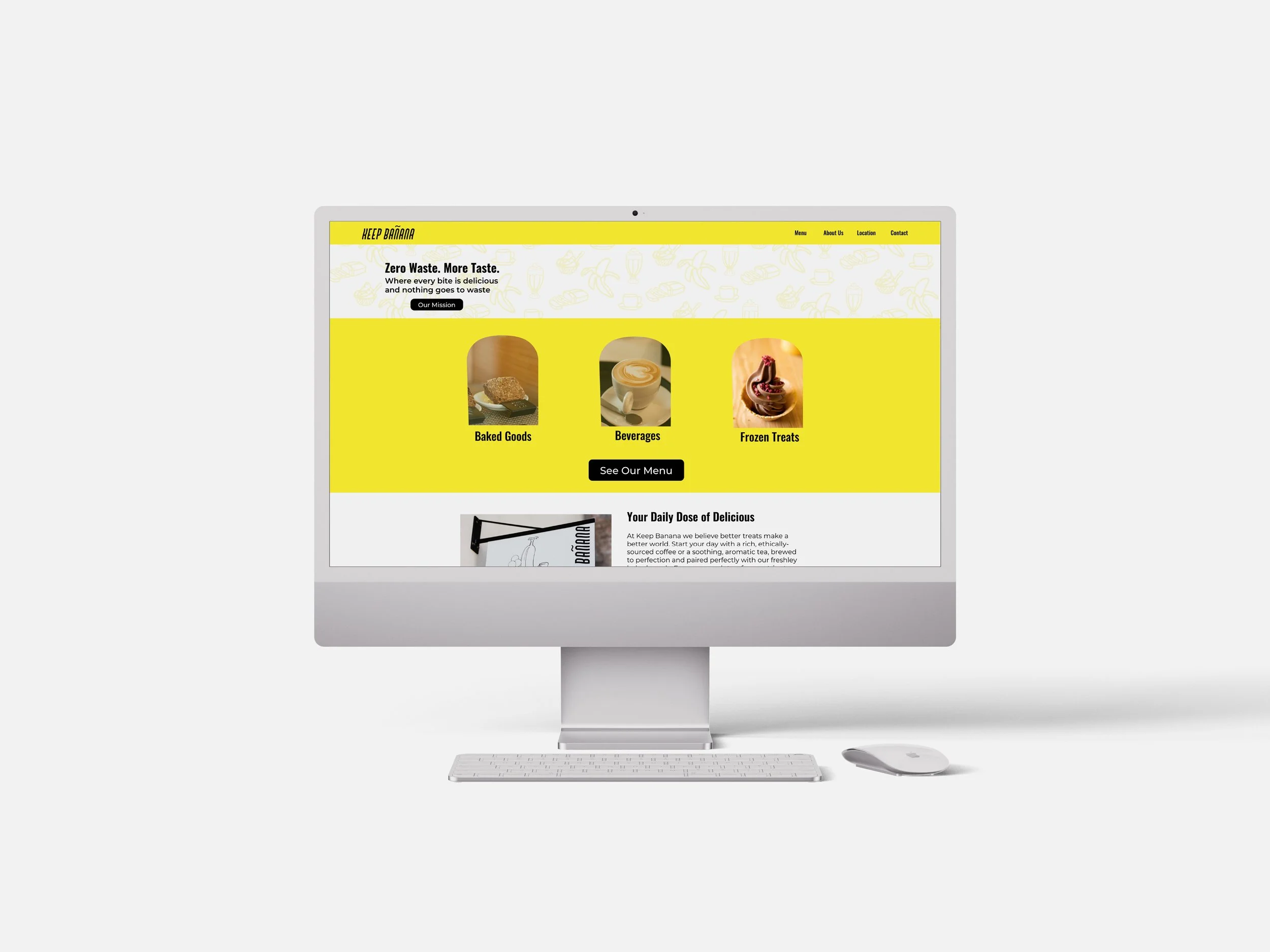
Keep Bananas